PROJECT OVERVIEW
The original Wakajugbe app, despite its potential, faced significant challenges due to a subpar user interface (UI). This outdated and unintuitive design discouraged users from engaging with the platform, leading to low user adoption and retention rates.
One of the shareholders expressed deep concern about the app's impact on the company's growth and reputation. The poor UI was perceived as a major barrier to attracting and retaining customers both drivers and riders, hindering the app's ability to compete effectively in the competitive car-hailing market
My Role
I worked as the sole designer alongside a developer in the design process. The organization reached out to me to elevate the user experience of the platform.
Timeline
2 Weeks
Team
1 Developer
1 Product Designer
Skills
User research, Competitive Analysis, Design System, Wireframing, Prototyping
User Engagement
Better user experience, more user engagement and revenue growth.
Time spent on task
During the initial discovery call, one of the major issues that was brought up was time spent booking a ride.
Visual Appeal
One of the ways to improve user experience it to make the platform appealing to use.
Research Findings
Before jumping into any Ideation, since I couldn’t conduct an actual user research, I decided to user another option which was to conduct a secondary research, to understand the industry, then I downloaded the application and conducted a quick usability testing with 3 participants including myself and here’s what I found :
The Initial Design (Before)
Color Usage
The app's inconsistent color scheme hindered user comprehension and increased time on task. Elements were visually confusing, leading to frustration and delays in completing tasks.
Navigation Issues
Users struggled to find their way around the app or website, often getting lost or confused which led to frustration and decrease in user satisfaction.
Poor Accessibility
The app was not accessible to users with disabilities, such as those who are color blind, rely on screen readers or assistive technologies.
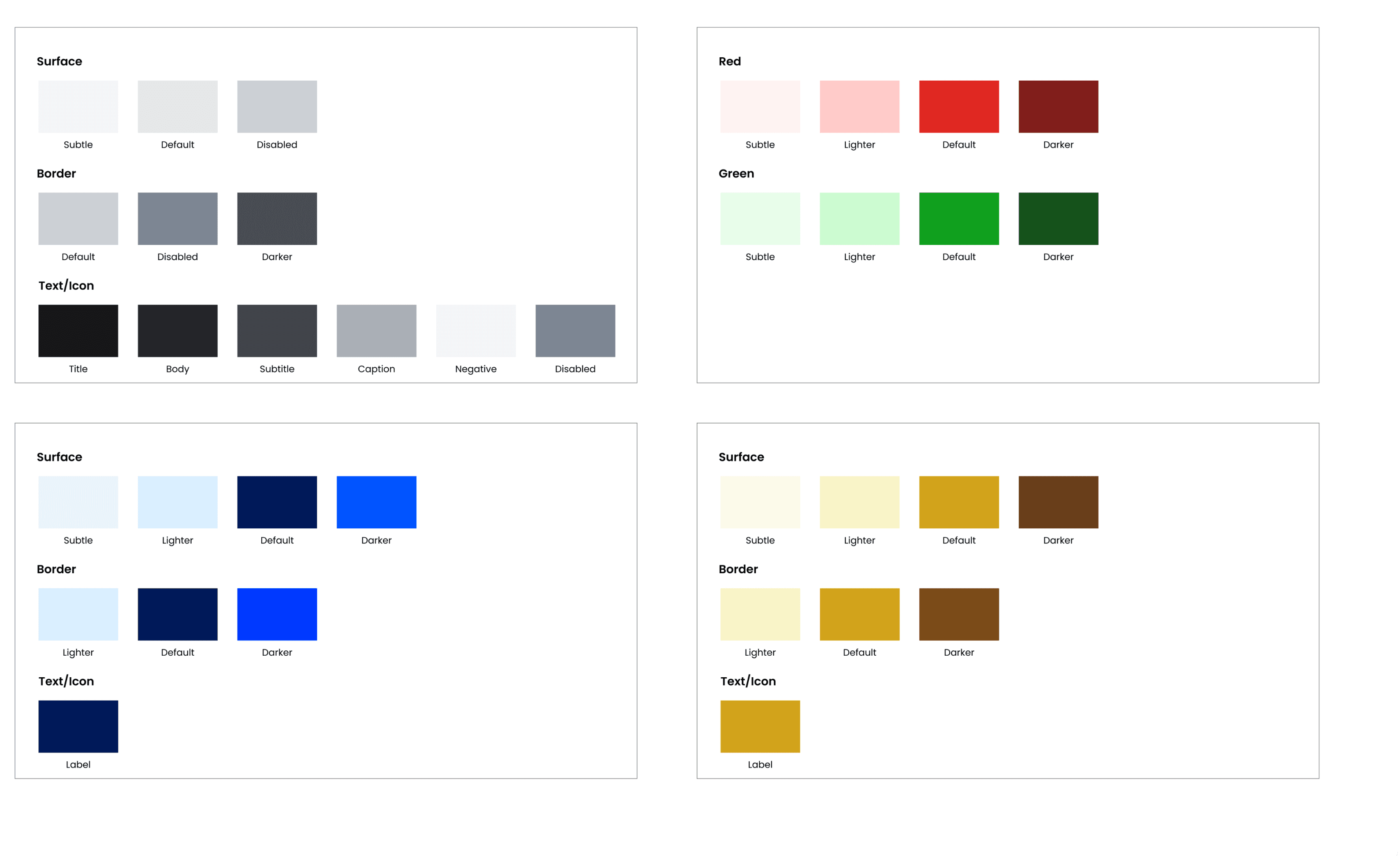
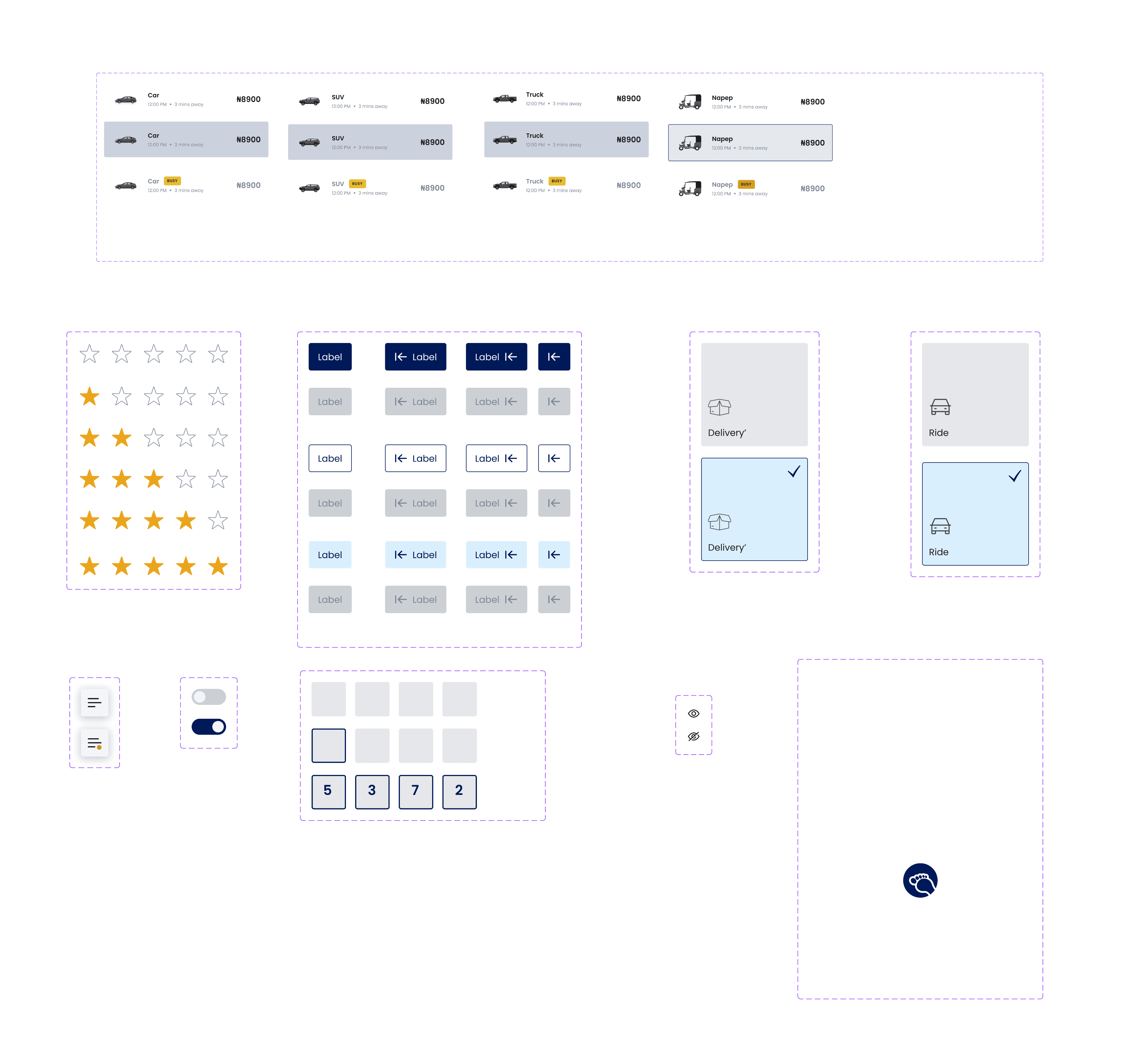
Ideation and Design System
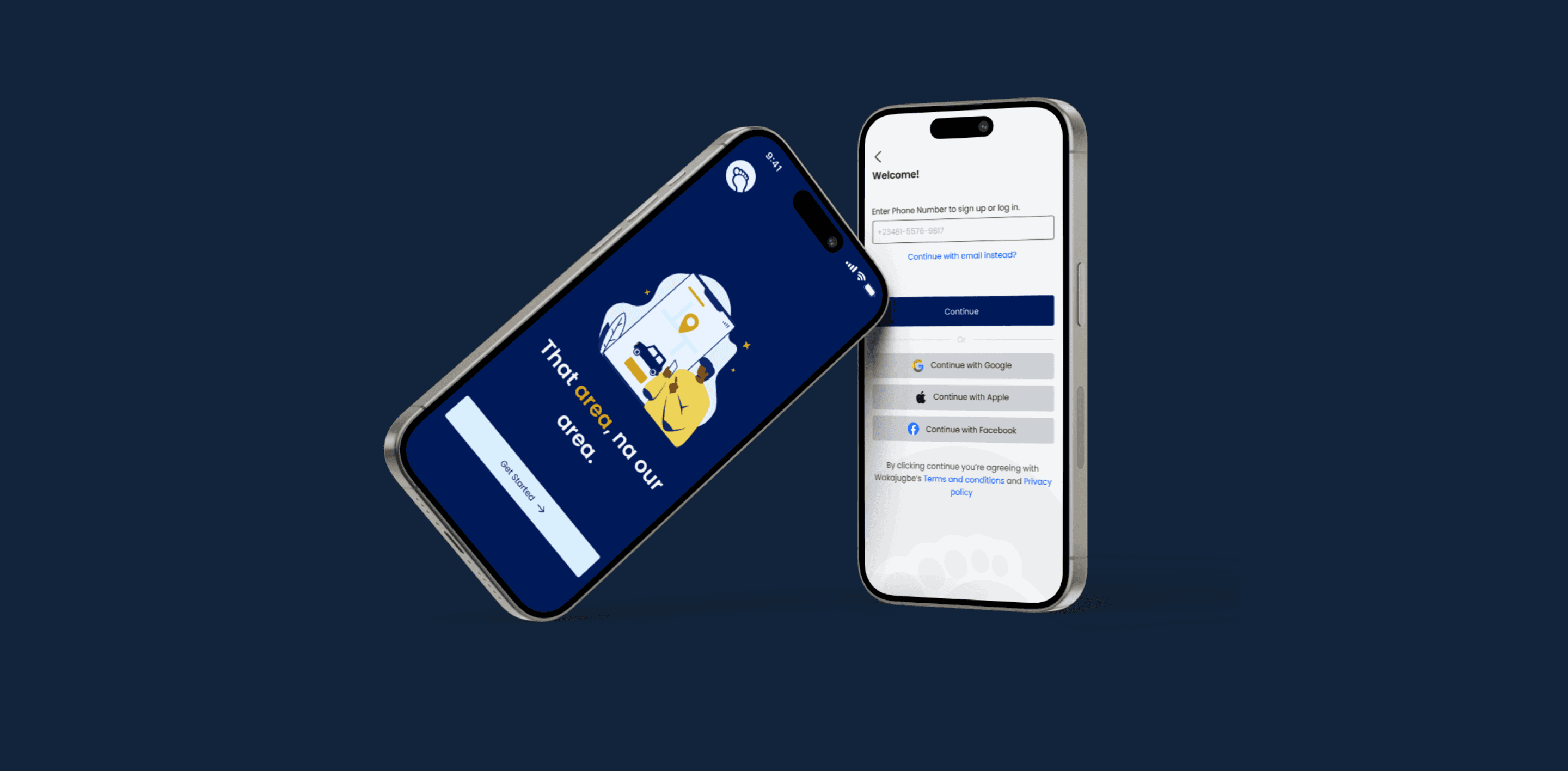
Leveraging insights from competitive analysis (competitors: Uber, Bolt, Taxify) and usability testing, I designed a user flow that was approved by stakeholders. I then created a custom color palette that, while adhering to brand guidelines, allowed for creative exploration of typography and iconography.
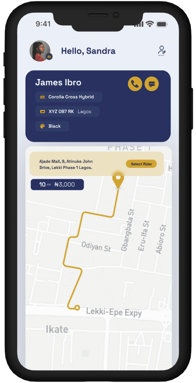
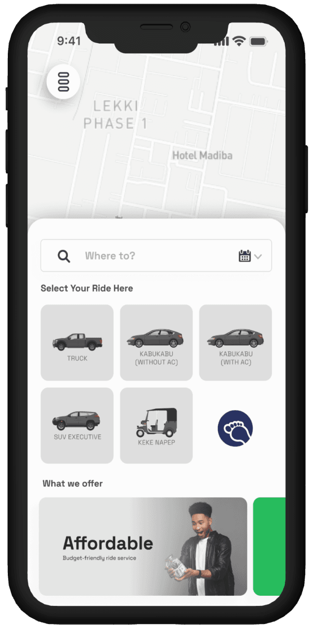
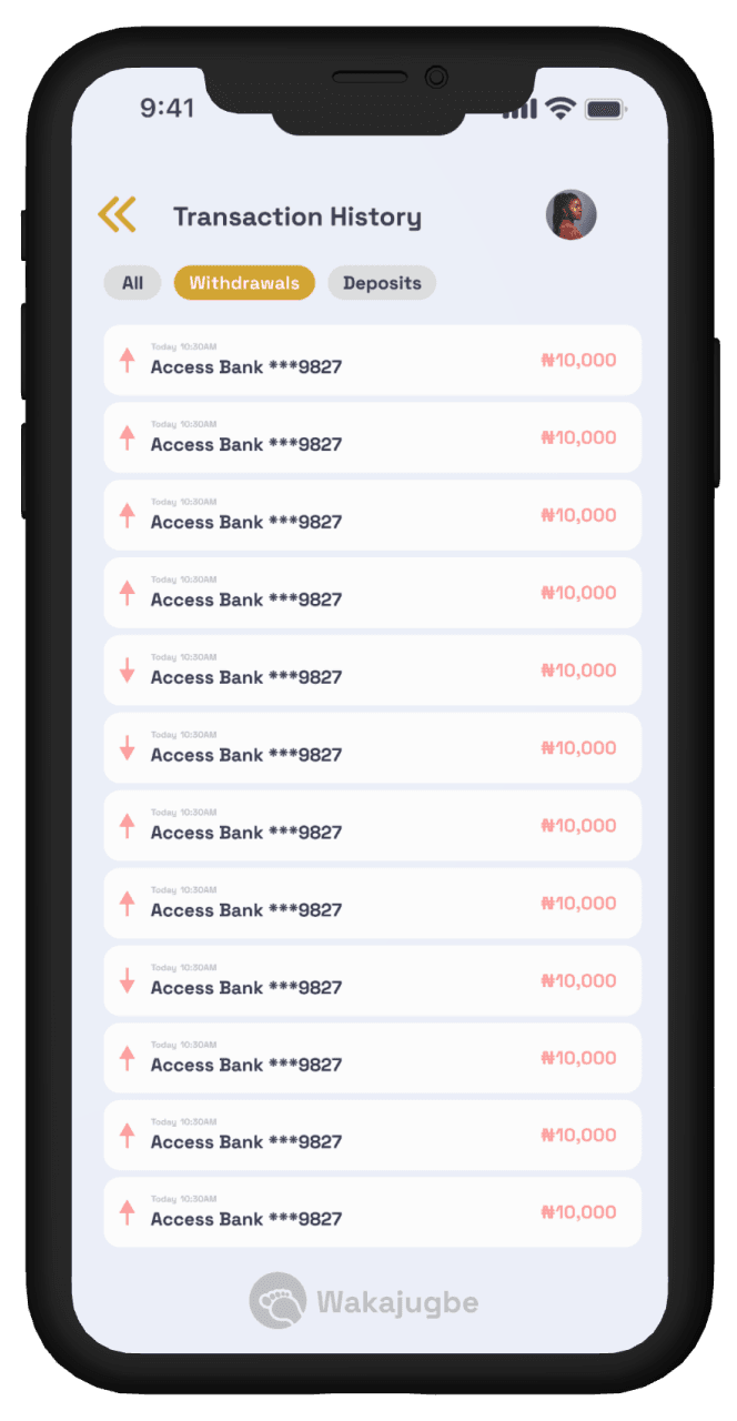
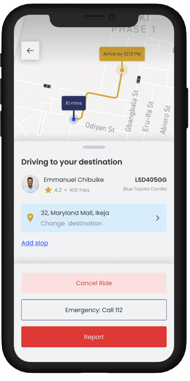
Solutions (After)
Focused on solving the issues initially brought to me and the problems I got from conducting my own research. I was able to come up with these solutions
Better Accessibility
By streamlining the color palette, typography, and iconography users can navigate and understand contents and information shown to them on the platform
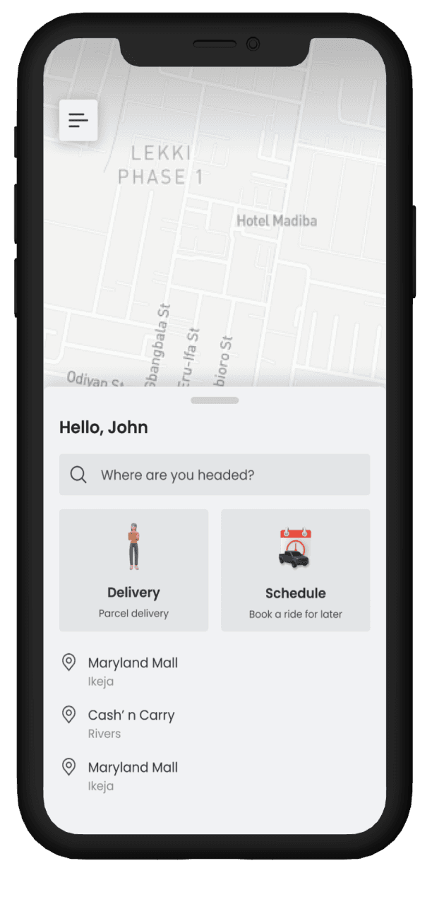
Ride Scheduling
My research showed that users value the ability to easily schedule rides for specific dates and times.
Improved Information Architecture for Enhanced User Experience
By redesigning the information architecture, I reorganized the content hierarchy and navigation structure to create a more intuitive and user-friendly experience. This involved:
Clear and concise labeling
Logical grouping
Efficient navigation
Intuitive content flow
Optimized search functionality
Lessons Learned
Here are some lessons I learned during my time on this project:
Always base your design decisions on your users, this results in the achievement of business goals
Effective collaboration with stakeholders is essential for aligning design decisions
If I was chanced to...
I will conduct another Usability test to ensure that my designs actually solved immediate users needs.
Footer